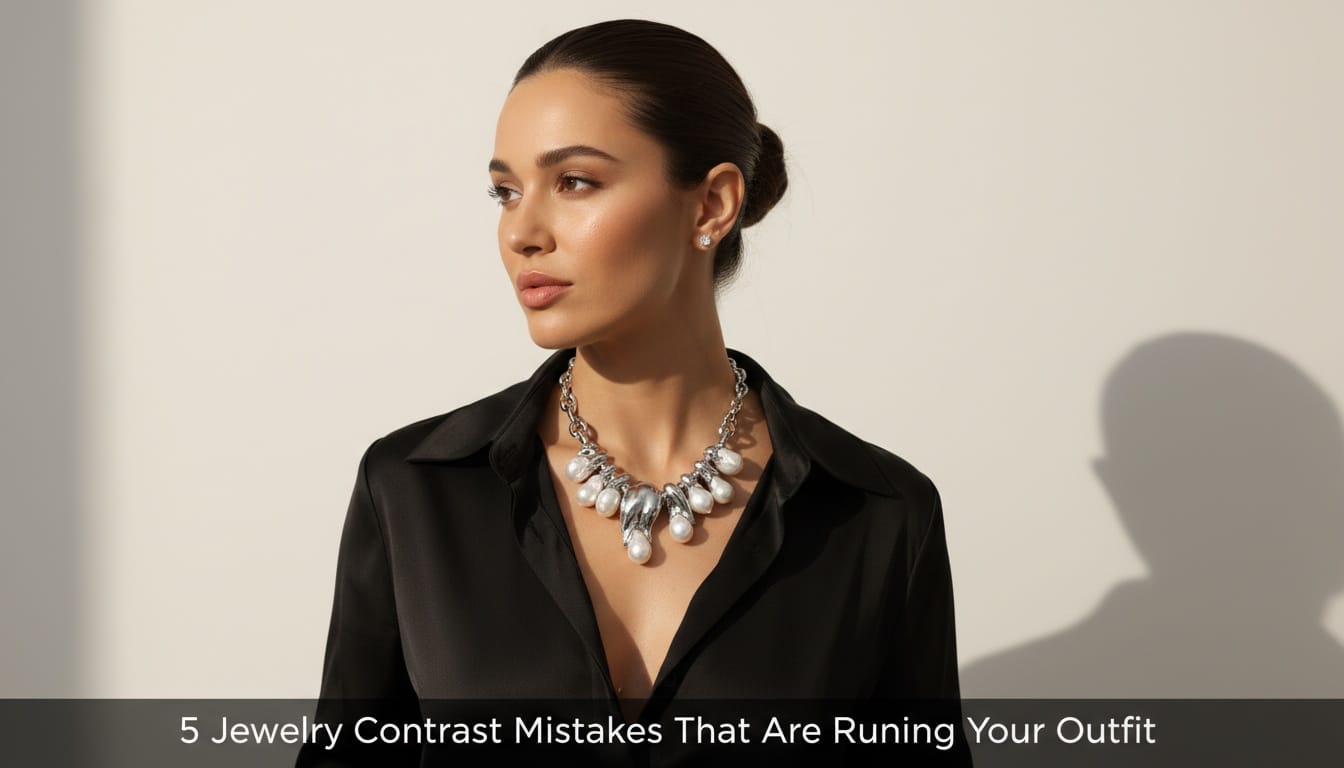
5 Jewelry Contrast Mistakes That Are Ruining Your Outfit: Style Guide
Fix the jewelry contrast mistakes that are ruining your outfit with our expert guide. Learn how to pair metals and necklines to look polished every day.
Many people struggle to look polished because they make small jewelry contrast mistakes that throw off their entire look. These errors happen when your jewelry and your clothes fight for attention instead of working together. By learning a few simple rules about color, size, and style, you can make sure your accessories always make you look your best.
Wearing jewelry is like adding spices to food. If you add too much salt, you cannot taste the vegetables. If you wear the wrong jewelry, people see the shiny metal but they do not see you. In India, we love our gold and silver, but wearing them the wrong way can make a beautiful saree or a smart kurta look messy. Explore our silver jewellery collection for versatile pieces that work with traditional and modern outfits.
Before we start, let me tell you about Eternz: a trusted jewelry marketplace featuring 300+ brands. Every piece comes with authenticity certification. They offer fast, same-day delivery in major cities, and a special "WELCOME20" discount for first-time buyers.
What are the most common jewelry contrast mistakes?
Jewelry contrast mistakes happen when the colors, sizes, or styles of your pieces fight with your clothes instead of helping them. These errors make an outfit look messy or boring rather than put together. Most people fail to realize that jewelry should either match the energy of the clothes or provide a deliberate, pleasing difference.
When we talk about contrast, we mean how things look when put next to each other. If you wear a bright yellow dress with very pale, tiny silver earrings, the earrings might disappear. That is a lack of contrast. If you wear a heavy gold necklace with a neon green sports shirt, the styles fight. That is bad contrast.
Here are the five biggest mistakes people make:
- Ignoring skin undertone: Wearing metals that make your skin look dull or gray.
- Competing statement pieces: Wearing a huge necklace and huge earrings at the same time.
- Wrong neckline pairing: Choosing a necklace that overlaps with the edge of your shirt or dress.
- Mismatched metal weights: Mixing very thick chains with very thin, dainty rings.
- Vibe mismatch: Wearing wedding-style jewelry to a casual office meeting.
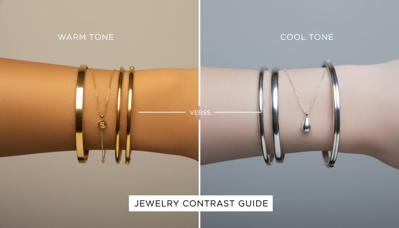
Mistake 1: Ignoring your skin undertone
Choosing the wrong metal for your skin tone is a major jewelry contrast mistake because it can make your skin look tired or washed out. Your skin has a "temperature" called an undertone, which is either warm, cool, or neutral. When the metal color does not match this temperature, the jewelry looks like it is sitting "on top" of you rather than belonging to you. For a deeper dive into this topic, check out our guide on how to match jewellery to your skin tone.
How to find your skin undertone
You can find your undertone by looking at the veins on your wrist. If your veins look green, you likely have a warm undertone. If they look blue or purple, you have a cool undertone. If you cannot really tell, you might be neutral.
| Skin Undertone | Best Metal Choice | Why it works |
|---|---|---|
| Warm | Yellow Gold, Copper, Brass | These metals have yellow bases that glow against warm skin. |
| Cool | Silver, Platinum, White Gold | These metals have blue or white bases that look crisp on cool skin. |
| Neutral | Rose Gold, Mix of metals | Neutral skin can pull off almost any color without a clash. |
Why this matters in India
In India, yellow gold is very popular for cultural reasons. However, if you have a very cool skin tone, bright 24k yellow gold can sometimes look a bit "harsh" against your skin. In this case, choosing a lighter 14k gold or a matte finish can help bridge the gap. If you love silver but have warm skin, try oxidized silver. The dark, blackened parts of oxidized silver create a shadow that helps the jewelry look better on warm-toned skin.
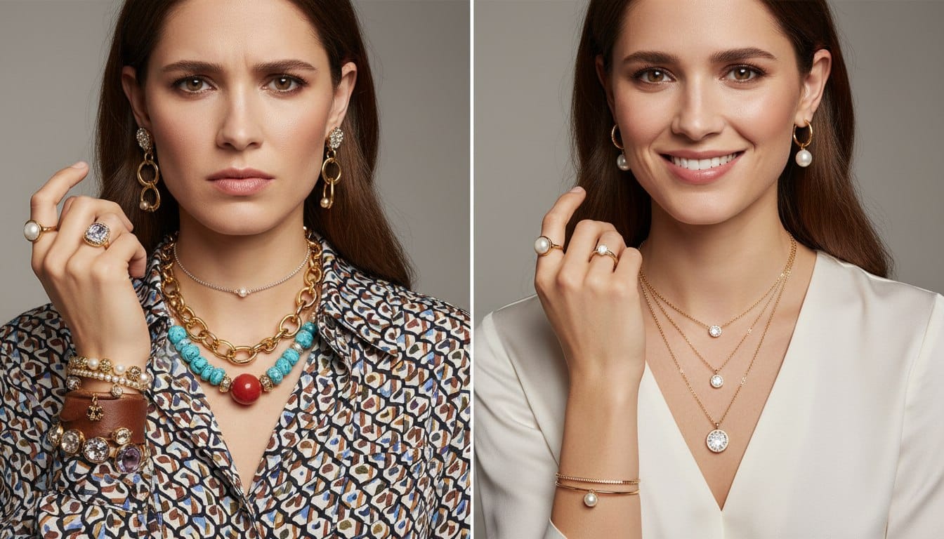
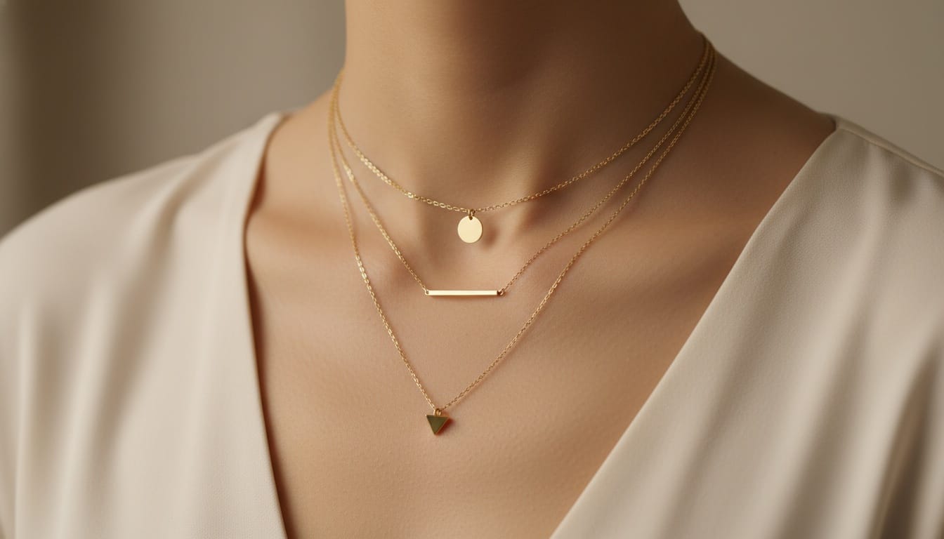
Mistake 2: Competing statement pieces
Wearing more than one large "statement" piece of jewelry creates a visual struggle where the eye does not know where to look. This is a common jewelry contrast mistake that makes an outfit feel heavy and disorganized. To fix this, you should choose one "hero" piece and let everything else be a "supporting actor."
The rule of the focal point
Think of your outfit like a movie. You can only have one main star. If you have a massive Kundan necklace, your earrings should be small studs. If you are wearing giant Jhumkas, you should probably skip the necklace entirely or wear a very thin, simple chain. Explore our jhumkas collection for stunning statement earrings that pair beautifully with minimal necklaces.
- Necklace focus: Wear small earrings and no hair accessories.
- Earring focus: Wear a bare neck or a very dainty pendant.
- Bangle focus: Keep your rings simple and your sleeves short enough to show the jewelry.
- Ring focus: Keep your bracelets minimal so your hands do not look "cluttered."
| Primary Piece | Recommended Secondary Piece | What to Avoid |
|---|---|---|
| Heavy Choker | Tiny Studs | Long Chandelier Earrings |
| Oversized Hoop Earrings | Simple Gold Band Ring | Chunky Layered Necklaces |
| Stacked Bangles | Small Nose Pin | Heavy Wristwatch on the same arm |
| Statement Cocktail Ring | Delicate Bracelet | Multiple thick rings on every finger |
If you wear too many big things, people see the jewelry before they see your face. Good jewelry contrast should always draw the eye up toward your eyes and smile. When you wear a heavy necklace and heavy earrings, the eye gets stuck bouncing between the two, which is distracting.
Mistake 3: Wrong neckline and necklace pairing
A necklace that sits at the wrong height or shape for your neckline creates a messy look that ruins the silhouette of your outfit. This jewelry contrast mistake happens when the jewelry overlaps with the fabric in an awkward way or leaves too much empty space. Matching the shape of the jewelry to the shape of the neck is the logic for a clean look. For a complete reference, see our ultimate guide on how to pair necklaces with necklines.
How to match necklaces to necklines
The goal is to follow the lines of your clothes. If you wear a V-neck shirt, your necklace should also form a "V" shape. If you wear a round crew-neck, a round necklace looks best.
- V-Neck: Use a pendant on a chain that creates a "V" shape. This makes your neck look longer.
- Square Neck: Use a short necklace with a clear horizontal line or a choker.
- High Neck/Turtleneck: Use a long chain that falls past the chest. This breaks up the solid block of fabric.
- Strapless: A choker or a short necklace that sits on the collarbone looks beautiful because it fills the empty skin.
The "No-Touch" rule
A simple pro-tip is the "no-touch" rule. For most outfits, your necklace should either sit entirely on your skin or entirely on the fabric. If the necklace is constantly half-on and half-off the edge of your shirt, it looks like an accident. This small gap or clear overlap creates a "clean contrast" that makes the jewelry pop.
Mistake 4: Mismatched metal weights and proportions
Mixing jewelry pieces that have very different visual weights can make your collection look like a random pile of items rather than a styled set. This jewelry contrast mistake happens when you wear a very thick, heavy watch with a tiny, paper-thin gold chain. The heavy item "crushes" the small item visually, making it look like it does not belong. Master the art of mixing with our ultimate guide to jewellery layering and stacking.
Understanding visual weight
Visual weight is how heavy an object "looks" to our eyes. A dark, thick piece of wood looks heavier than a clear piece of glass, even if they weigh the same. In jewelry, visual weight is decided by thickness, color, and texture.
- Thickness: A thick cuff bracelet has high visual weight.
- Texture: A hammered, rough metal surface looks heavier than a smooth, polished surface.
- Color: Darker stones or oxidized metals look heavier than clear diamonds or bright silver.
| Item Type | Visual Weight | Best Pairing |
|---|---|---|
| Chunky Men's Style Watch | High | Thick leather bands or solid metal cuffs |
| Dainty Infinity Ring | Low | Thin silk threads or thin gold chains |
| Large Pearl String | Medium | Medium-sized pearl studs or gold hoops |
| Heavy Kada (Bangle) | High | Solid rings or thick chains |
If you want to mix weights, do it in a "staircase" way. Start with one thick piece, add a medium piece, and then a small piece. This creates a transition. Jumping straight from very thick to very thin is usually a mistake because the thin piece looks like a mistake or a broken item.
Mistake 5: Overlooking the occasion context
Wearing jewelry that does not match the "vibe" or "mood" of your surroundings is a major jewelry contrast mistake. This is called a "context clash." Just like you would not wear flip-flops to a wedding, you should not wear heavy bridal jewelry to a grocery store or a professional office. For polished professional looks, explore our office wear jewellery trends guide.
Matching jewelry to the event
In India, we have a wide range of jewelry, from simple "daily wear" gold to heavy "temple jewelry." The mistake often happens when we try to make a casual outfit look "fancy" by adding very expensive, formal pieces. Instead of looking fancy, it often just looks out of place. For effortless everyday elegance, check out our daily wear earrings collection.
- Office/Professional: Stick to small hoops, studs, or a simple watch. The jewelry should be quiet so people listen to your words.
- Casual Brunch: Use fun materials like beads, threads, or silver. This is the time for "boho" styles.
- Festivals/Weddings: This is where you bring out the gold, diamonds, and stones. The "contrast" here should be with the bright colors of your silk saree or lehenga.
- Gym/Active: Wear almost no jewelry. If you must, use tiny studs. Heavy jewelry at the gym is a safety risk and a major style error.
| Occasion | Recommended Style | Material to Choose |
|---|---|---|
| Formal Meeting | Minimal & Geometric | Matte Gold or Platinum |
| Sunday Market | Colorful & Natural | Beads, Wood, or Thread |
| Sangeet/Party | Sparkling & Moving | Diamonds, Polki, or Crystals |
| Daily Chores | Comfortable & Flat | Simple gold bands or small studs |
Unique Angle: The "Texture Contrast" Secret
One mistake most people never talk about is ignoring the texture of their clothes. This is a "pro-tip" for those who want to look truly high-fashion. Jewelry should have a different texture than your fabric to create a beautiful contrast.
If you are wearing a very shiny silk saree, wearing very polished, shiny gold can sometimes be "too much shine." In this case, wearing "Antique finish" or "Matte" jewelry creates a beautiful contrast. The dull metal makes the shiny silk look even better.
On the other hand, if you are wearing a flat cotton kurta, shiny jewelry is perfect. The sparkle of the jewelry gives life to the "flat" look of the cotton. Always try to pair "Shiny with Matte" or "Smooth with Textured."
Summary of How to Fix Jewelry Contrast Mistakes
To avoid these errors, always look in a full-length mirror before you leave the house. Ask yourself: "Where is my eye going first?" If your eye is jumping between three different shiny spots, you have a contrast problem.
- Check your skin tone first to choose the right metal color.
- Pick one "Star" piece and let the others be "Fans."
- Ensure your necklace shape follows your shirt's neckline.
- Keep the "thickness" of your pieces similar.
- Make sure the jewelry matches where you are going.
By following these simple steps, you will stop making the jewelry contrast mistakes that ruin your outfits. Instead, your jewelry will become a tool that highlights your beauty and shows off your personal style.
Frequently Asked Questions
1. How do I choose the right jewelry metal for my skin tone?
To find the best match, check the veins on your wrist. Green veins suggest a warm undertone which looks best with yellow gold or copper. Blue or purple veins indicate a cool undertone which pairs perfectly with silver, platinum, or white gold.
2. Can I wear statement necklaces and large earrings at the same time?
It is generally a mistake to wear two large statement pieces together as they compete for attention. To maintain proper jewelry contrast, choose one focal point, like a heavy necklace, and pair it with small studs or simple accessories.
3. What is the best way to match a necklace to a V-neckline?
For a V-neck, you should choose a pendant on a chain that forms a matching V shape. This follows the lines of your clothing and prevents the necklace from overlapping awkwardly with the fabric.
4. Why does my jewelry look out of place even if it is expensive?
You might be experiencing a vibe mismatch or context clash. Wearing heavy bridal or festival jewelry to a casual office setting or the gym creates a contrast error where the jewelry style does not match the occasion.
5. Is it okay to mix different metal weights like thick and thin chains?
Mixing very thick items with very thin ones can make the smaller pieces look broken or accidental. To mix weights correctly, use a staircase approach by adding a medium sized piece to transition between the heavy and dainty items.
6. What type of jewelry should I wear for office or professional settings?
For professional settings, stick to minimal jewelry like small studs, simple hoops, or a classic watch. The jewelry should be quiet and polished so it complements your professionalism without being distracting.
7. How do I prevent my necklace from looking awkward with my outfit?
Follow the "no-touch" rule: your necklace should either sit entirely on your skin or entirely on your fabric. Avoid necklaces that constantly ride up and sit half on the edge of your collar, as this creates a messy look.
8. What is visual weight in jewelry and why does it matter?
Visual weight is how heavy a piece looks to the eye based on thickness, texture, and color. Mismatched visual weights can make an outfit look unbalanced. Aim to group pieces with similar visual weight or create a gradual staircase transition.
9. Can I mix silver and gold jewelry together?
Yes, mixing metals is acceptable, especially for those with neutral skin tones. The key is to ensure the pieces have similar visual weight and style so the combination looks intentional rather than accidental.
10. How does fabric texture affect which jewelry I should wear?
For best texture contrast, pair shiny fabrics like silk with matte or antique finish jewelry. Pair flat, matte fabrics like cotton with shiny, polished jewelry. This contrast makes both the fabric and the jewelry stand out beautifully.